COVER REVEAL (in People Magazine!) + The Secret Behind Book Cover Design
Diary #2: Finally announcing my next book!
Oh. My. God. People Magazine just announced my book and did the cover reveal!!!
(trying to calm down)… ahem… (be normal)…
Hello, Protagonists! In this post, you’ll find:
🤓 What I’m Reading This Week
💛 Announcing My Next Book
🤩 Cover Reveal!!
🎨 Behind the Scenes: How Publishers Come Up with Cover Art
🤓 What I’m Reading This Week
Practical Magic by Alice Hoffman - I’m re-reading this for our upcoming (Oct 27) Book Club for Writers & Curious Readers (date/time and discussion Qs here).
I watched the movie on my flight back from the Danish book festival, and I’m enjoying re-immersing myself in the written version of the story and seeing the differences.
note: Practical Magic was the first book written in the series, so even though it’s not chronologically first on the story timeline, you only need to read Practical Magic (not the others) for our book club meeting.
“Why We Love Looking at Paintings of Food” (article, Gastro Obscura) - I felt like this was written for me because I do, in fact, enjoy looking at still lifes of food!
💛 Announcing my next book!
This is part of a year-long series of author diaries, where I take you behind-the-scenes: from idea to publication of a novel.
In my last author diary entry, I confessed keeping my new novel a secret from you. Why, when I’m usually so open with you?
This book was… different. The idea was, for some reason, more fragile than others. There are some stories you can shout about from the moment the idea arrives, and others—like this one—which needed to be kept close, to be allowed to grow slowly without the influence of anyone else’s thoughts or eyes.
But now it’s finally time to share…
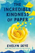
My next book is called The Incredible Kindness of Paper.
*deep breath*
Okay, I did it. I told you the title. So why is it still hard, even now, to tell you what it’s about?
Maybe because the heart of this story is so important to me, and I’m worried I won’t do it justice.
Here is the official book description:
For fans of Matt Haig and Clare Pooley, an enchanting novel about a pair of long-lost childhood friends who find themselves magically linked through origami flowers as adults—from the New York Times bestselling author of the “fresh, magical, and hopelessly romantic” (Sarah Addison Allen, New York Times bestselling author) The Hundred Loves of Juliet.
In elementary school, Chloe Hanako Quinn is assigned Oliver Jones as her pen pal partner. Before sending her letter, she also whispers a note into it…and he hears her. Little does she know it would be the beginning of a friendship that would bloom into something more. That is, until disaster strikes, and Oliver and his family disappear without a trace.
Now over twenty years later, Chloe is a high school guidance counselor in New York City. But life in the Big Apple is not what she dreamed it would be as she faces a layoff, rising rent, a situationship, and loneliness. Desperate for encouragement, she gives herself a pep talk via uplifting messages written on yellow origami paper that she folds into roses. When one of the roses unexpectedly finds its way to a neighbor in need of cheering up, a desire to spread kindness and optimism is sparked in Chloe, who begins folding more roses and leaving them around town.
Across the city, Oliver has picked himself up from the rough circumstances that forced him to leave everything behind as a teenager—including Chloe. Now a successful financial analyst, Oliver’s past continues to haunt him. But when the city is suddenly inundated with yellow origami roses, a specific one finds its way into his hands and changes his life forever…
Where the Idea Came From
Everywhere I look, people are on their phones.
They text rather than see their friends in person.
They scroll social media while they’re sitting at the dinner table with their loved ones.
They walk around with earbuds in all the time, shut off to the outside world.
We’re living in an epidemic of loneliness, and it’s partially our own fault. Yes, technology can be addicting, but we have agency, too.
So that’s what The Incredible Kindness of Paper is about.
Fighting loneliness.
Reconnecting with others.
And making small acts of kindness in everyday life, one person at a time.
Introducing my publisher and editor
In my diary entry about How Book Auctions Work, I told you I’d reveal who won the auction: it was Lara Jones at Atria/Emily Bestler Books (which is part of Simon & Schuster)!
I am so thrilled to be working with Lara and her amazing team!
🤩 Cover Reveal: The Incredible Kindness of Paper
I am shaking…
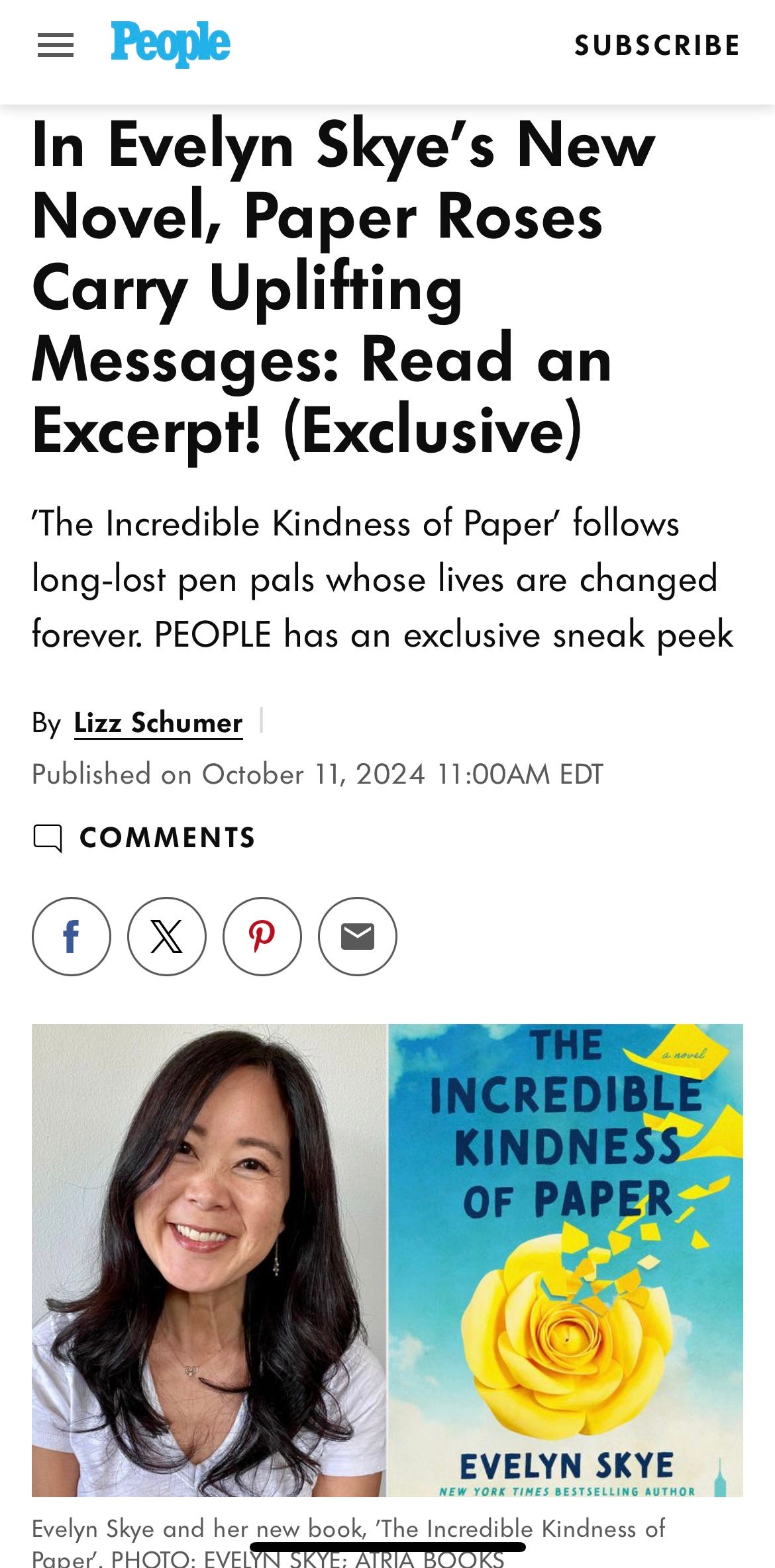
I can’t believe that People magazine just did the cover reveal for my next book!!
I’ve dreamed of a cover reveal at a huge media outlet for literally my entire career. But with top media coverage for books dwindling these days, I thought that any chance of that dream coming true was long over.
But the team at People loved the description of The Incredible Kindness of Paper, and we are all OBSESSED with the cover. My publisher nailed the feeling of the book:
Hopeful!
Cheerful!
with a touch of whimsy!
You can see the COVER REVEAL on People.com, along with an EXCLUSIVE, early excerpt of my book!
»note: The following is a peek at the process in traditional publishing, which is where my experience lies. Things work differently in the indie publishing world.
🎨 Behind the Scenes: How Publishers Create Cover Art
Whether you like it or not, readers do judge books by their cover.
And publishers know it.
That’s their big, unspoken secret. Authors want to believe that covers are artistic representations of the story inside, but contrary to popular belief, the main purpose of a book cover is to advertise the book at a glance.
Publishers create cover art with marketing, publicity, and sales as their top priority.
But why?
The problem of discoverability in a world of too many books
Of course, you want each book to stand out and be recognizable on its own, but you also want to make sure it attracts people who would love your book, if only they knew it existed.
Therefore, cover art is like shorthand for people to understand what kind of book it is.
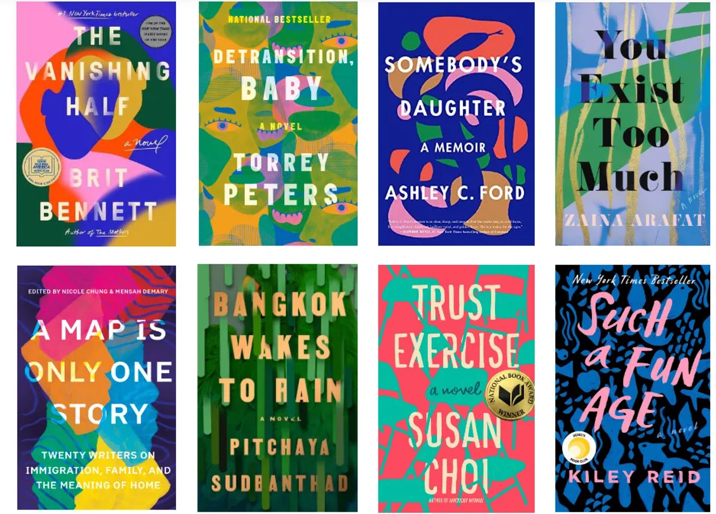
For example, we’ve recently been in an era where colorful blobs mean a book is literary fiction:
None of those covers actually tells you what the story is about. But if you like literary fiction, you’ve now been subconsciously trained to see color blobs and think, “I might like that book, too.”
(Here’s a satirical take on those literary color blob covers, over on LitHub.)
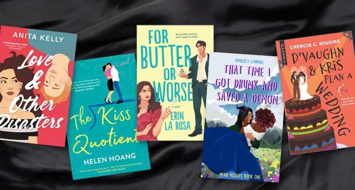
Then there’s the illustrated cover, which signals “beach read” or romance:
And there was also the headless girl trend in YA in the late 2010s. I could go on.
The point being, the cover is a selling point. The art department works with the sales team (and sometimes gets feedback from big retailers like Barnes & Noble) on how best to represent the book and make sure the cover signals to a potential reader, “Hey! You might like me!”
So where does the author come in?
Before the art department begins working, my editors always asks me to share some book covers that I like.
This is an interesting exercise for me, because as you may recall, I have aphantasia, which means I don’t really see images in my head.
» (if you missed it, there’s more on aphantasia here:)
Anyway, I try my best, which usually means I ask my writer friends, who then shower me with links to books that might have a similar “look and feel” as mine.
However, I make sure to tell my editors that I’m more interested in what they think. After all, they have all the sales data of all the books published in the last few years.
They also have their finger on the pulse of upcoming books. They’re the experts; I’m just a writer who is really bad at imagining images.
Cover concepts
Once the author submits some ideas, the art department gets to work. It usually takes a month or two before I hear back from them.
That’s when they present me with some cover concepts.
Sometimes they are sketches (if they are going the illustrated route), along with samples of different artists’ portfolios for me to choose from.
Other times, they are mock-ups that are like rough drafts, but with varying layouts or color schemes and font options.
They ask for my feedback, as well as my agent’s. Keep in mind, they may not agree with everything I say, but that’s okay. I want them to utilize their expertise in both design and sales to get my book a cover that will snag readers’ attention!
Now they go back to work in their artist caves and come back a while later with the cover in near-final state for approval.
What if the publisher creates a book cover you hate?
Funny you bring this up. I actually posed this question to my recent podcast guests, Sara Raasch and Beth Revis, and they had some hilarious stories to share.
I’ve only had one cover I truly hated, and it wasn’t the whole thing, just an aspect of it. And because I have a reputation for being very level-headed and easy to work with, when I politely push back on something, my editors listen. (We were able to compromise on that cover.)
Beth Revis’s advice is that she will point out why the cover isn’t marketable. That’s her trick for getting publishers to change the cover design, because they are invested in selling the book to as many people as possible. She says that when she can come back to her publisher with specific reasons why she doesn’t think a cover is working for marketability, they listen.
But I’m lucky that is not the case for The Incredible Kindness of Paper! I LOVE my cover!!
Are you serious about your writing?
Every Tuesday & Friday, you’ll get a new author interview, publishing insights, creativity mini-challenge, or something else to make you more creative, inspired, or happy. Subscribe now--it's free!


Congrats! I love your title and the book theme! I’m looking forward to reading it. I love everything about paper and I relate to the pen pal story because we were assigned one in school; it was very enjoyable to receive a letter from the other side of the world. Letter writing is definitely a lost art in today’s tech world; when my son went to summer camp one year, they had to hand in their phones for the week and he said “they actually talked to each other and it was nice.” 🤓
Congratulations on a beautiful cover, a reveal in PEOPLE, and an enchanting book, I have no doubt. I loved hearing about your inspiration for it, as an antidote to loneliness and our disconnected society precisely because we are too digitally connected. I have most certainly noticed the "color blobs" signalling literary fiction and how similar they all were and thus in some ways indistinguishable from one another, a disservice to the author and readers. Your cover illustration is so much better. I just love it. I am also glad covers have moved away from pink when a novel had anything to do with romance in the commercial/upmarket genre. Enough with the pink!