Hello, Protagonists! In this post, you’ll find:
🤓 What I’m Reading This Week
📃 Behind the Scenes: First-pass pages for The Incredible Kindness of Paper
Exclusive sneak peek at my first-pass pages
What are “running heads”?
Font selection - why it’s important
🤓 What I’m Reading This Week
Friends and Strangers by J. Courtney Sullivan - (fiction) - Courtney was such a wonderful guest on our podcast a few weeks back that I had to pick up another of her novels.
Friends and Strangers is about adjusting your identity and life when you shift from child-free career woman to stay-at-home mom, as well as unexpected intergenerational friendships.
I’m just cracking this book open, but I’m already loving the quality of the prose, and I’m nodding along, remembering this period of my own life.
Long Lost Bram Stoker Story Found in Dublin - (article, RTE) - I love literary coincidences! History had forgotten this short story by Bram Stoker when—130 years after it was published in a newspaper—it was re-discovered during a casual visit to the library.
Martha Stewart has no interest in being on The Golden Bachelorette - (article, People Magazine) - The self-made billionaire just published her 100th book! But would she want to be on The Golden Bachelorette. I laughed at her awesome reason for turning it down (even if the network would pay her a million dollars).
📃 Behind the Scenes: First-Pass Pages for The Incredible Kindness of Paper
This is part of a year-long series of author diaries, where I take you behind-the-scenes: from idea to publication of a novel.
I just received my first-pass pages for The Incredible Kindness of Paper!
This is a huge milestone in the life cycle of a book, because it’s the first time the manuscript is no longer a Word document—now the fonts have been chosen, little decorative touches have been added, and the novel is typeset like the pages of a real book. It’s still in PDF form, but still!
First-Pass Pages
These are the pages that I will use for the first round of proofreading.
Hence, “first-pass” (because it’s the first pass through proofreading).
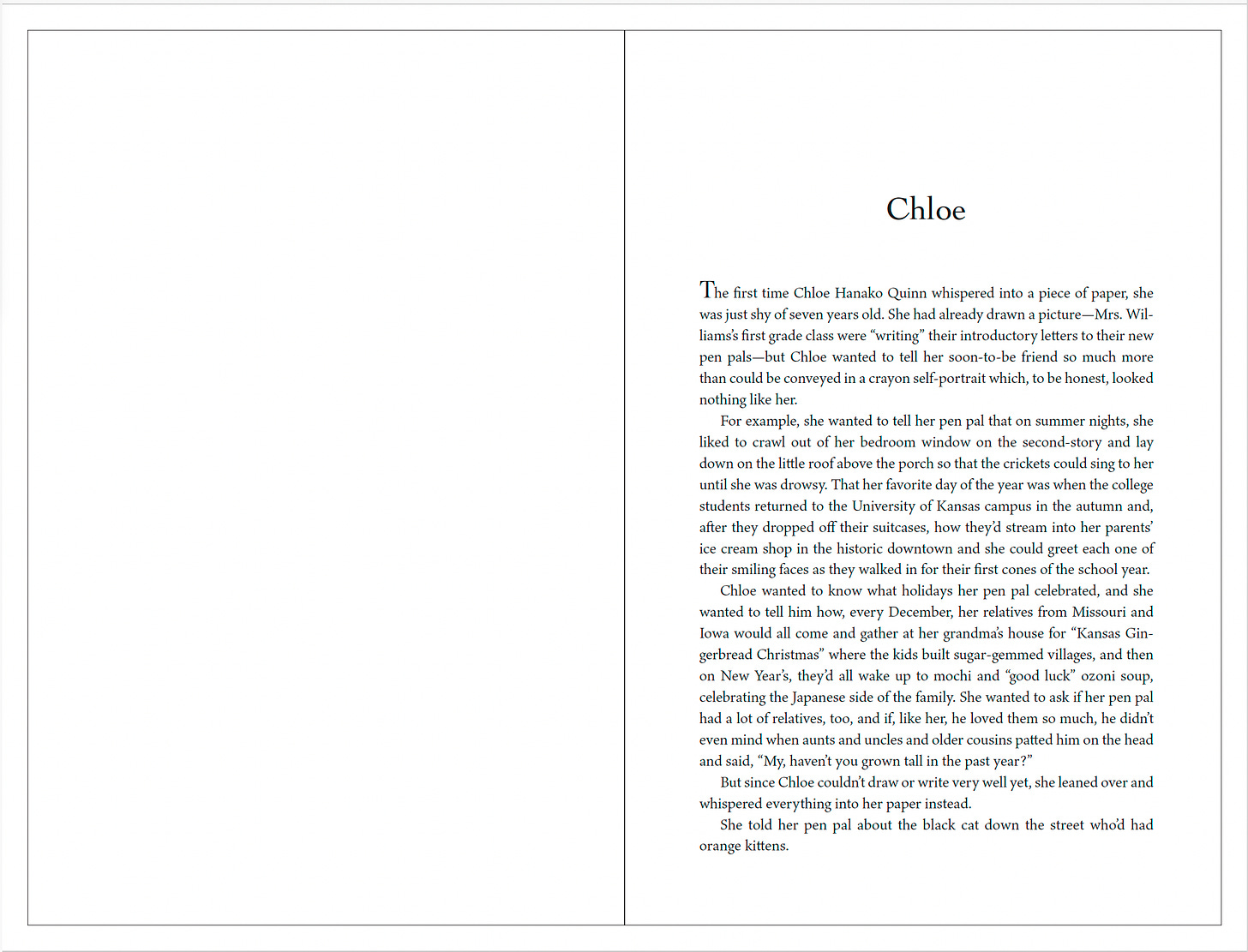
Here is page 1 of The Incredible Kindness of Paper!
(I know they might be too small to actually read, but the more important thing is that you can see that they’re starting to look like book pages, rather than a Microsoft Word file.)
Running Heads
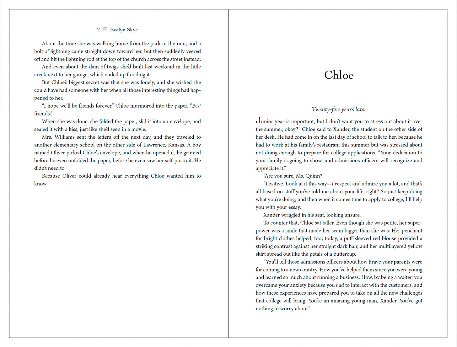
The top of each page will often have page numbers. On the top left page, you’ll have the author’s name. On the top right page, you’ll have the book title.
In publishing lingo, these are called “running heads.” (However, pages where a new chapter begins do not have them.)
Here, you can see a sample of one of the running heads for The Incredible Kindness of Paper:
page number
author name
and a cute little detail:
If you read my previous diary entry, you’ll recall that Chloe writes uplifting messages inside yellow origami roses.
In the story, she signs each of her paper roses with a little doodle that looks like a rosebud inside a heart.
So the book designer ran with that idea and created little heart-rose doodles for the running heads! I love thoughtful little details like that.
(If you expand the photo and zoom in on the running head, you can see the heart-rosebud between the page number and my name).
Font Selection
We also went back and forth on which fonts to use. There are lots of different fonts in this book:
Font for the book in general
Chloe’s childhood handwriting
Chloe’s adult handwriting
Oliver’s adult handwriting
Text messages
Font on signs (like “Thelma’s Doggy Day Care”)
I’m sure there’s another one that I’m missing…
The goal is to make sure the fonts are different from each other, look like handwriting (where applicable), yet are readable and don’t slow the reader down.
This is critical—you can make or break your story… the latter, if you choose a font that looks pretty to you but isn’t easy to read.
You don’t want your readers to have to puzzle over what a fancy script says.
That pulls them out of the story and puts a halt to the narrative flow.
The line you wrote loses impact, because instead of absorbing what it says, the reader is using their energy to figure out the hard-to-read font.
As the author, I know what the text says. But the reader doesn’t. So I have to remember that when I’m choosing fonts.
Fun fact: Sometimes I will ask Tom to come over and look at the fonts to see if he can read them easily and immediately. If he has to work at it, then I know that my editor and I need to ask the design team for more font options.
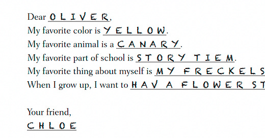
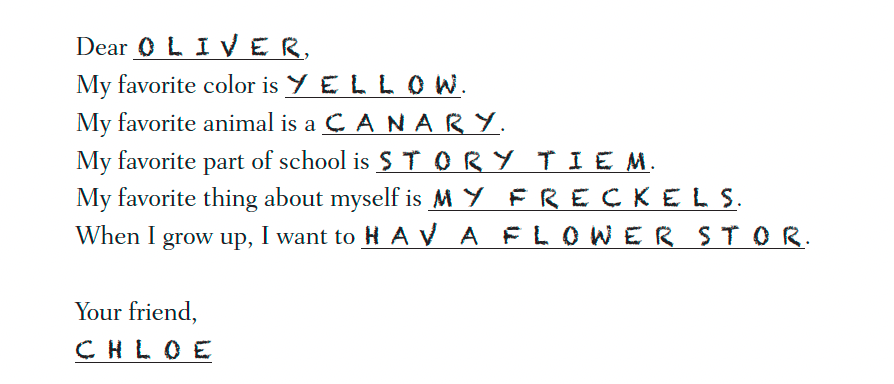
For example, the following is the font we chose from one of Chloe and Oliver’s first pen pal exchanges as children.
Chloe filled out a “form” letter that her teacher provided (you remember these kinds of things from elementary school):
So that’s an overview of first-pass pages.
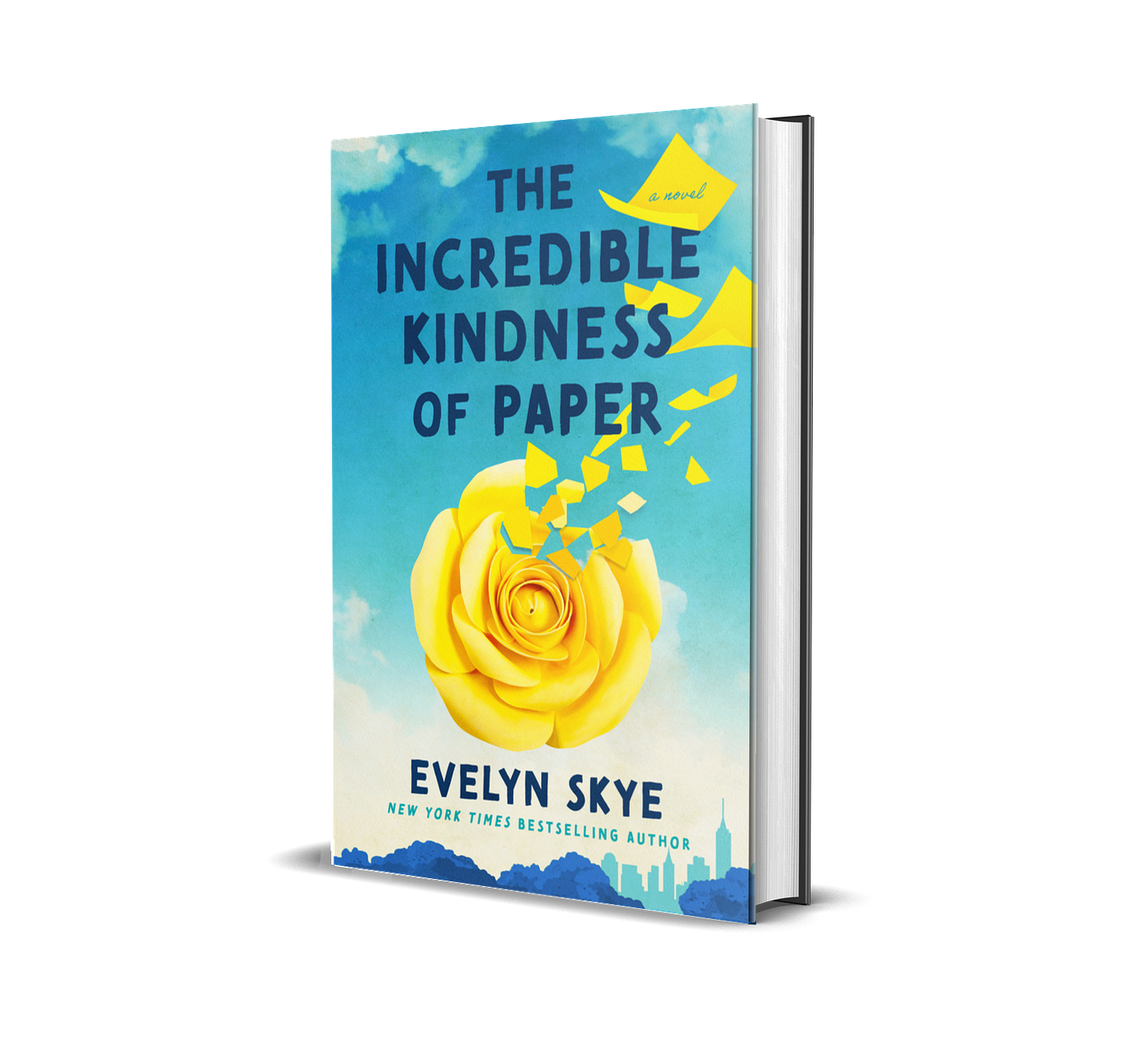
If you’re interested in The Incredible Kindness of Paper, you can preorder a copy! (Preorders help authors a lot—I’ll explain why in a future Diary entry. 🥰)
Got Questions about First-Pass Pages?
Drop them in the Comments—If it’s straightforward to answer, I’ll do it in the Comments. If it’s a little more complicated, I’ll explain during the next Book Club meeting, which you can attend live or watch the recording afterward. 💛





Love this sneak peak. It’s so great. I love the little heart rosette and where it is placed. I feel like I’m on this journey with you when you share this process with us. I love the name of Chloe and Oliver. I can’t wait to read more.
This is so interesting - thank you for sharing. How do the fonts work for the ebook? I downloaded the sample of the Lisa Marie Presley memoir recently - it’s meant to be in two different fonts (one for Lisa Marie and one for her daughter, Riley) and on kindle it’s the same font throughout.